
What pricing psychology can teach us about marketing analytics reporting
If you think psychology and specifically pricing psychology is just for sales pages, think again.
The same behavioural tricks used to influence buying decisions can actually help you build better marketing analytics reports.
Why? Because reports are just another form of communication. And how you present data dramatically shapes how people interpret it.
Let’s break it down.
1. Anchoring
Give metrics context
In pricing, anchoring means showing a higher price first to make the second option feel like a deal.
In reports? It means providing a reference point that gives meaning to your metrics.
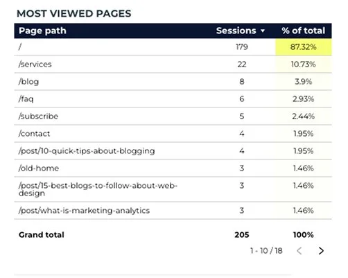
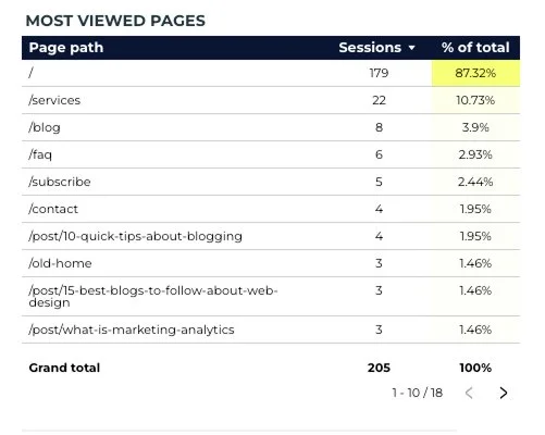
Example: Instead of just showing that pages had X sessions, add a second column showing that it's 9.6% of total traffic. That percentage helps frame the raw number, so you can instantly tell which matter most.
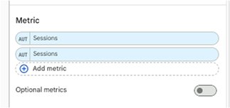
We use Looker Studio, a free visual reporting tool to create reusable marketing dashboards.
To create a column like the one above, add a second metric to the table that is the same as the first. (yep, weird)
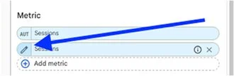
Then hover over the second metric’s “AUT” until you see the pencil and click the pencil:
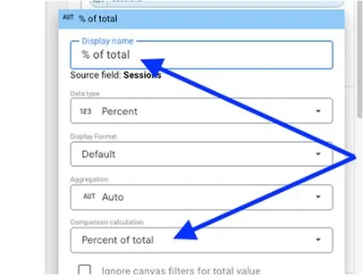
In the edit field, replace the display name with % of total, and the comparison calculation field with “percent of total”.
Anchors reduce mental effort. They help people rank performance without doing math in their head.
Now you can look at this table and say 87% of all your website sessions are for the homepage, and 10% for the services page. This gives you an interesting benchmark as you perhaps diversify your marketing channels and aim to bring traffic to other pages on your site.
2. Breakdown
Make big numbers feel smaller
Pricing psychology loves to slice big numbers into smaller chunks: “Only $25/month!” sounds better than “$300/year.”
In reporting, this means breaking large totals into time periods or categories.
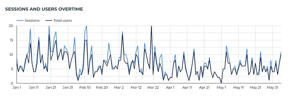
Example: Instead of showing a time series line chart for a year-to-date period with a dimension of “day”, you could show a bar graph that breaks that series into specific numbers per month.
BEFORE
AFTER
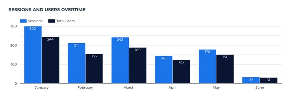
Smaller units make performance feel more consistent and digestible.
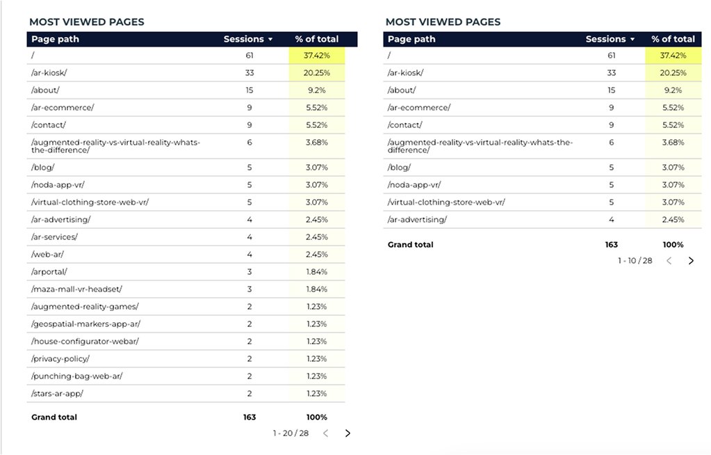
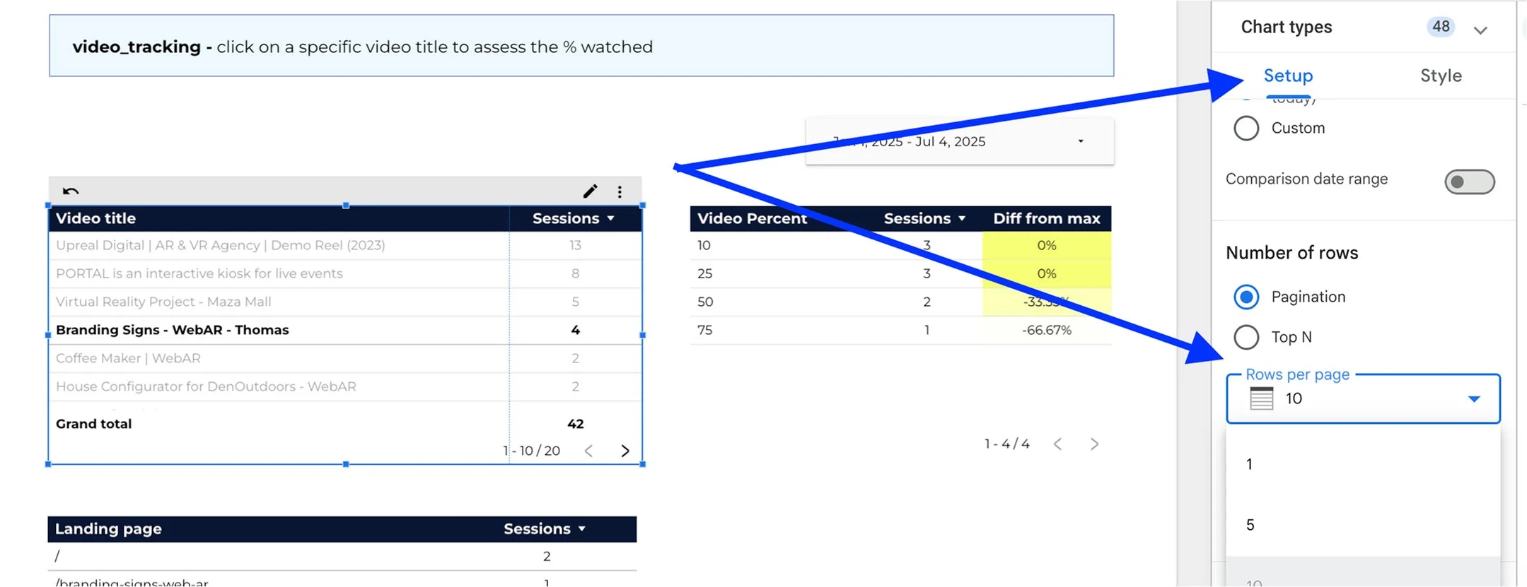
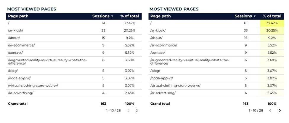
This could also be applied in an example where you simply minimize the amount of default rows in a table to reduce cognitive overload. So instead of featuring 20 rows by default, like the table below on the left, you’d set the table limit to 10 rows, like the table below on the right.
In Looker Studio, that’s done by heading to > edit > setup > rows per page
3. Visualization
Let colour do the talking
Just like smaller fonts make prices look smaller, design choices shape how we interpret data.
Using heatmaps or gradients helps highlight what matters — especially in tables.
Example: A column of percentages with a yellow-to-white gradient makes the top performers pop instantly. No extra copy. No complicated charts.
People are drawn to patterns and colour before they read the text. Make it work for you.
4. Processing fluency
Round, clean, easy
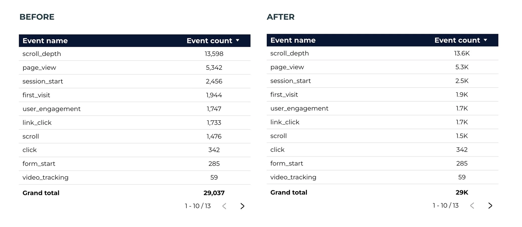
$1.35M feels less intense than $1,350,000.
Same goes for marketing analytics. Round your numbers. Format them consistently. Use short labels.
Example: Use "1.2K" instead of "1,213" unless exact figures are necessary. Avoid overwhelming viewers with decimal places or clutter.
In your tables on Looker Studio, you can use the “compact numbers” toggle under the styling tab. Scroll down to the metric you want to click the toggle for:
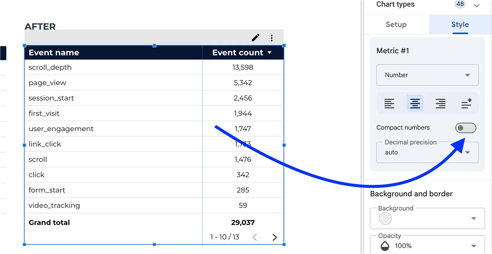
Then you will achieve this look afterwards, which is a small but powerful change.
Your data should guide, not exhaust.
Final Thoughts
The goal of a good marketing analytics report isn’t to show everything.
It’s to show what matters in a way that people can understand at a glance.
Just like good pricing design nudges someone to buy, good reporting design nudges them to act.
Need help setting this up or want a custom Looker Studio dashboard built for your brand? Reach out to us for 1-1 coaching or for done-for-you services – we love a good data glow-up. ⚡
💙 The Harsh Marketing Team